I'm thinking ahead to this summer's Urban Sketching Symposium in Amsterdam! Registration starts bright and early February 2, info is here. There are so many amazing workshops planned, I am truly honored to be a part of the incredible line up of instructors. I'll be teaching a workshop called "Towers are Like Wedding Cakes, and other "Ah-Ha" Moments", featuring some tips and tricks that have inspired a new book I'm working on!
I love to teach perspective because it's something so many people fear, ignore, or fake, but there is no need if you understand a few simple principals.
In honor of this Sunday's Seattle Urban Sketchers meet-up at the University of Washington's Suzzallo Library, I'm posting this step-by-step from a few years ago in order to show
my very "architectural" process for constructing and completing a perspective sketch.
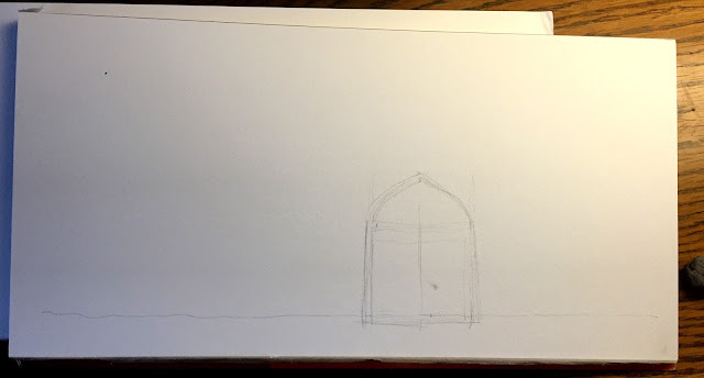
Step ONE, Looking at the view ahead of me, I simplify what I see to a very basic shape, starting with a rectangle. This is basically what I call the "shape of the space", as if you were to slice the room like a loaf of bread, this is the shape you would see. It's the shape of the end wall. I measure the height and width with my pencil, then I transfer that shape to my paper. I place this shape very low on my paper, as I want to be able to draw a lot of the ceiling.
Then I locate my eye level and mark it in my sketch by drawing a horizontal line all the way across my paper...notice how LOW my eye level is relative to the shape of the space drawn. almost on the floor. On the eye level line is the vanishing point, that tiny dot just to the right of center (not the smudge right above it!) That spot is directly in front of me as I face the back wall of the space, and it's the point where the many receding lines will all converge, making this a one-point perspective sketch.
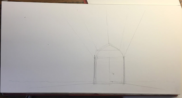
Step TWO--by drawing in the three elements of step one (big shape, vanishing point, eye level), I have everything I need to do this drawing accurately in perspective. I can use the vanishing point to start drawing in the big lines, the major architectural elements of the space. For this, I use a small plastic triangle, as it speeds things up to be able to snap accurate lines QUICKLY...
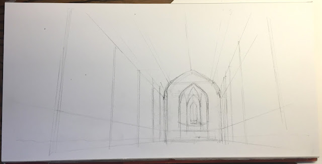
Step THREE-- you can see I'm putting more of the bones in...the verticals represent the columns, or each structural bay of the space. I start to angle the lines closest to me to exaggerate the sense of height.
Step FOUR-- I start working on putting in the ceiling...big shapes get broken down into smaller shapes, then I break those shapes into even smaller shapes...that is how structure works! I also start to put in the chandeliers, as they cover up a good bit of the ceiling. Each one relates to a structural bay in the ceiling, and the lamps on the left relate to the lamps on the right.
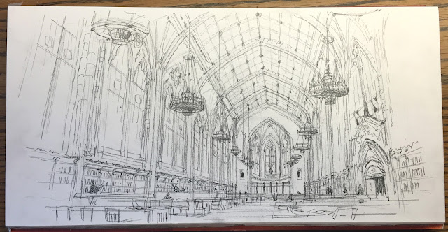
Step FIVE-- here is pretty much the complete line drawing. I try to build up the focus with detail and linework at the back, allowing the lines closest to me to fade out. I also added the book shelves, as that builds up the sense of activity at the pedestrian level and helps to ground the sketch. Notice how FLAT the tables are because they are so close to my eye level. Notice how details are just suggested, I don't take the time to actually draw in every detail.
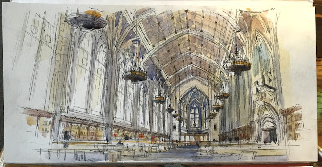
Step SIX--Color...I started by putting an underpainting layer of yellow on all the areas I want to be warm, usually the surfaces that advance spatially or are in the sunlight (what little there was!) Then I layer in more colors...mostly grays, as nearly everything in this space was gray to beige...I also build up the color carefully at the end of the space, the focal point of the perspective and the sketch.
And here is a scan of the final image, complete with signature and reminder of where I was! Also a detail so you can actually see the linework. I often lose a lot of the linework once I add color, which always makes me a little sad, as I LOVE the pencil work.
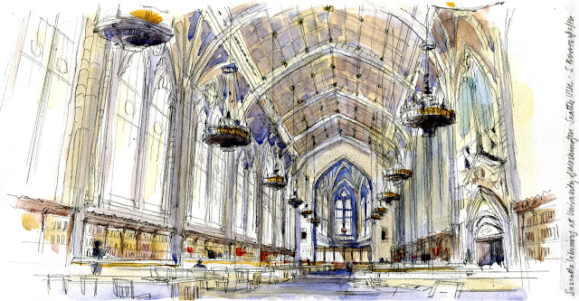
So there it is, beginning to end. Good practice for Amsterdam this summer!! It took about 1 hour and 15 minutes, sketched and painted on location. Paper is a Fluid watercolor block 8" x 16", Winsor & Newton watercolors, and my favorite Escoda Reserva size 10 travel brush. Also my 1" angled synthetic brush. for broad strokes in big areas.
I hope you found this helpful...see you in Amsterdam at the Symposium !


Hi Amazing Post!!! I like this website so much it's really awesome. Nice information About Best
ReplyDeleteDrawing classes in Chennai Porur.Thanks for sharing good information with beautiful images.I hope you will be post more like this beautiful posts.
We were struggling to make our socials stand out until we found this studio. They totally helped us with branded social videos that actually reflect our style and message. Super friendly team, great vibe during filming, and the edits were exactly what we needed. Highly recommend if you want real results online.
ReplyDelete