Stephanie Bower


Stephanie Bower | Architectural Illustration: www.stephaniebower.com | Sketching Workshops: www.stephaniebower.com | Sketches: on Instagram at @stephanieabower & http://www.flickr.com/photos/83075812@N07/ | Urban Sketchers Blog Correspondent www.urbansketchers.org | Signature member of the Northwest Watercolor Society
Showing posts with label @stephanieabower. Show all posts

Tuesday, January 8, 2019

Urban Sketchers Symposium 2019 in Amsterdam!!!


Happy New Year!!!

And what a great year it will be! 

Just announced, this year will be the 10th Annual global Urban Sketchers Symposium. It's an amazing event to attend, as there is sketching going on 24/7, talented people from around the world to meet and sketch with, and of course the opportunity to sketch in beautiful Amsterdam.

I am truly honored and so thrilled to be teaching at this year's event, a workshop called "Towers are like Wedding Cakes and other "ah-ha" moments"! I'll be sharing some of my favorite sketching tips... 

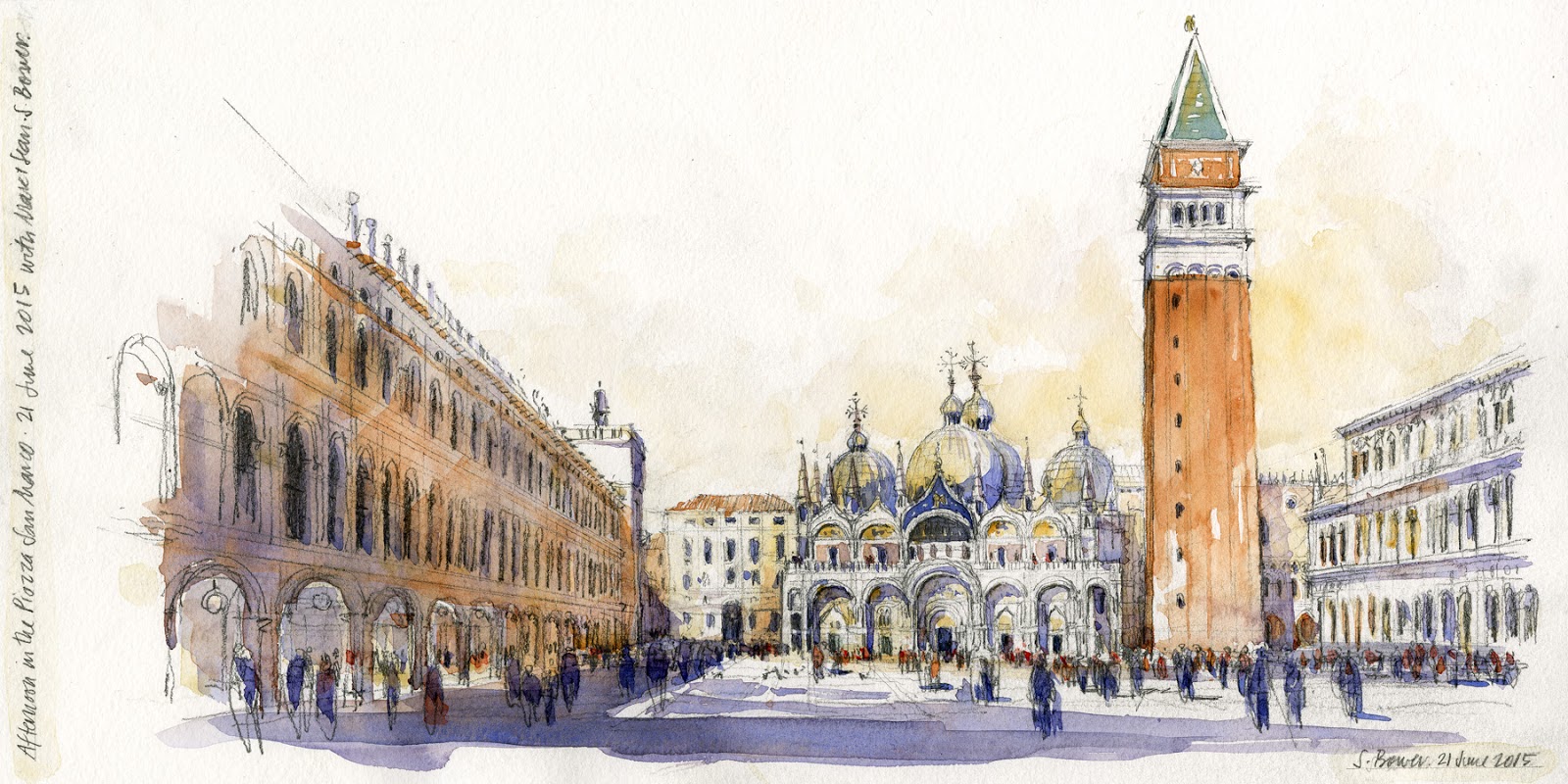
"did you know that towers are like wedding cakes, stairs are like wedges of cheese, and arches are definitely not horseshoes? Some of my favorite and fun sketching “ah-ha” moments have to do with relating architecture in perspective to other things we see and experience every day. I often use these concepts when teaching, as these metaphors can help us to demystify some of the complex forms we see in order to understand and draw them better...and it will be easier and more fun!"

To review info about the symposium and the line up of workshop, go to: 
Symposium Info Here

Registration for the symposium opens up February 2. Set up your account at Eventbrite now, then be ready. Set your alarm and register the second online registration opens!
Fingers crossed!


In addition to the symposium, there is so much going on... an insane amount of day job illustration work, nights and weekends spent working on a new book to come out in the Fall (yay!), workshops in Spain in May (spots are still available in Session One), Draw Civita Workshop in June (full, but there is always next year)...whew.

Here is wishing everyone a wonderful, creative, happy and healthy 2019! CHEERS!

(sketch at the top is The Ridderzaal and Binnenhof in Den Haag, The Netherlands. Sketched while sharing a bench with USk Den Haag member Marlene Dambrink. What a great afternoon it was!)

Tuesday, July 17, 2018

TIP 10/10: Domes are ROUND!


And here is the final post in this series of 10 TIPS!

Sketching Tip #10: Domes are ROUND!

This may seem rather obvious, but I see so many sketchers draw domes as sort of flattened out the shapes in which the "edges" are drawn as if they were sharp corners instead of rounded.

Domes are essentially a stack of ellipses, each ellipse sharing a common centerline. Take a look at this diagram of the round Radcliffe Camera done in my workshop in Oxford, England last year:


You'll notice that this building, similar to a dome, is a stack of ellipses in perspective.
All the ellipses are centered on one line in the middle that also connects the
very top of the dome with the center of the footprint of the building on the ground.  

You'll also notice that each ellipse gets FLATTER the closer it is to your eye level line.

Understanding this concept points out why the diagram of the flattened dome with "corners" is incorrect, and the rounded dome edge below works much better!


Domes don't have sharp corners!!


The "edges" of your dome should look more like this. They are rounded and
you can see the shape of the ellipse starting to curve behind the building.

And here is the completed sketch! You can see and feel the roundedness of the forms, especially by looking at the rounded "edges".


These same concepts apply to any rounded form. Take a look at this sketch of a building near Piccadilly Circus in London...


I hope you have enjoyed and learned a bit from these 10 blog posts! I will continue to post tips and more sketches, so please sign up to receive these posts by email using the sign up on the bar on the right.

And if you want to learn in person, I'll be teaching workshops next year in Spain and Italy...and more places too! 
I also have two online classes at Craftsy.com and a book you can find anywhere, 
The Urban Sketching Handbook: Understanding Perspective.

Thank you so much for your interest, and Happy Sketching!
Remember, don't fear perspective!!
Stephanie


Friday, July 13, 2018

TIP 8/10: Towers are like Wedding Cakes


Only three more to go! Here is sketching tip #8 of 10...

Sketching Tip #8: Towers are like Wedding Cakes!


Imagine a wedding cake...if one layer is off-center from the one below it, eventually we'd get a tragic cake collapse and wedding disaster!


Same for Towers. I often see towers in sketches that somehow look a little off. The reason: it's layers are not stacked properly in perspective!

So how to better sketch a tower? I'll show you two ways.

Method 1 -- find the center of the tower.
     As in wedding cakes, it's important to establish where the center of the tower is in order to draw it properly. We do this in perspective by using your skills from middle school geometry class:  drawing diagonals.
     If you think of the forms as transparent, this is much easier. I look at a tower and I think of a stack of 3-d blocks, usually getting smaller/narrower toward the top. I often lightly draw in the entire center line up the arch for reference. You can be sure whatever detail is at the very top of the tower, it sits on top of your center line!


Venice in 2015, sketching what may be one of the most famous towers in the world, the Campanile in the Piazza San Marco.
Here I am on the left, sitting in spot of great honor with the incredible Marc Taro Holmes and his friend and mind-boggling illustrator, Sean Andrew Murray. HA! No pressure at all !?!?

You can see how I don't just see the face of the sides of the tower, I see it as a stack of 3-dimensional blocks. 
Remember one or both sides of your tower will go to the vanishing point/s on your eye level.
Consider, each face of the tower steps inward toward the center from one layer to the next.


And here are the steps I use to draw the tower:

1 -- Start with the blocks, as above.
2 -- Use diagonals to find the center of each block.
3 -- draw in your center line all the way to the top of the tower.
4 -- Here, once I find the top of the center line, I can just connect it to the corners to get the pyramid shape at the top. This is easier because the faces of the pyramid are sloped.

I don't always draw every level like this, but it's important to understand this concept when you sketch a tower.


Method 2 -- Use Edges
     In reality, I probably use a combination of methods 1 and 2. This way is definitely easier... I look at the edges and where they are relative to each other. Examine how much each is set in from the level below it. 
     And at the end, I look at where the top of the tower is relative to the layers below, just to check I've got it right.


In this sketch of a tower at the Mezquita in Córdoba, Spain, you can see 
how each corner is set in from the one below it. An easy way to draw 
towers, although be careful you don't pull the layers off center!

Hopefully, one or both of these methods will help you see towers a little differently, and draw them better!

Wednesday, October 26, 2016

Workshop, Inside the Chiesa San Donato


Late June in Civita is blazing hot, so one of the ways we escape the heat is to sketch inside the Chiesa San Donato. I've done a few sketches of this lovely church on past trips, you can see the first one from 2013 in my Pentalic sketchbook below. 

The concept for this sketch above is exactly the same as for the one below...I always start with the big shapes. An advantage of this particular view what that I was also able to use that center arch as a way to determine where the elements on the far wall were located...for example, the spring line for the far arches is just about half way up the front arch.  So this makes getting shapes and proportions easier.

Here is the photo of the nave of the chiesa, and below it is the diagram I draw in the workshop to explain the concept of drawing the arches. As I always teach, we start with the shape of the space, then the VP and eye level lines, than I use this structure to fill in the basic lines that describe the space.

Pretty early on, I'll add the arches...first by drawing the rectangular bays made by the columns, then I put in the spring line where the arch starts.  You'll see I also lightly sketch in the entire ellipse, as this makes it easier to get the arch shape. Once I have all that structure in, I start filling in the sketch.

There is a lot more info on this in both my book and Craftsy classes.


Diagram sketch of the chiesa space and arches.

This is one of my all time favorite sketches!  It might be where I started doing these wide-angle views
that I love so much.
When I paint these sketches, I also approach the watercolor thinking like an architect. The first thing I'll do is paint in that pale blue (cobalt with a touch of perm. alizarin crimson) in all the openings, so that the voids appear to recede.  Next I'll use a little gray and yellow ochre to warm the walls and arches in the center nave, so that they advance in space. I'm always thinking about solids vs. voids in architecture.

And here we are at the end of the day, in front of the beautiful salmon colored Chiesa!!