Stephanie Bower


Stephanie Bower | Architectural Illustration: www.stephaniebower.com | Sketching Workshops: www.stephaniebower.com | Sketches: on Instagram at @stephanieabower & http://www.flickr.com/photos/83075812@N07/ | Urban Sketchers Blog Correspondent www.urbansketchers.org | Signature member of the Northwest Watercolor Society
Showing posts with label Stephanie Bower. Show all posts

Friday, January 25, 2019

Announcing New Workshop: San Antonio TX in April at The Pearl


GOOD BONES SAN ANTONIO Texas Perspective + Watercolor Sketching Workshop

April 5-6-7, 2019 |

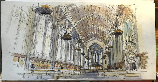
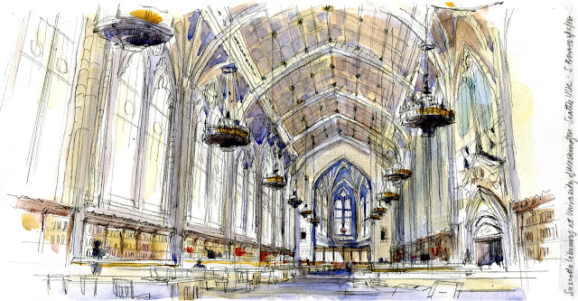
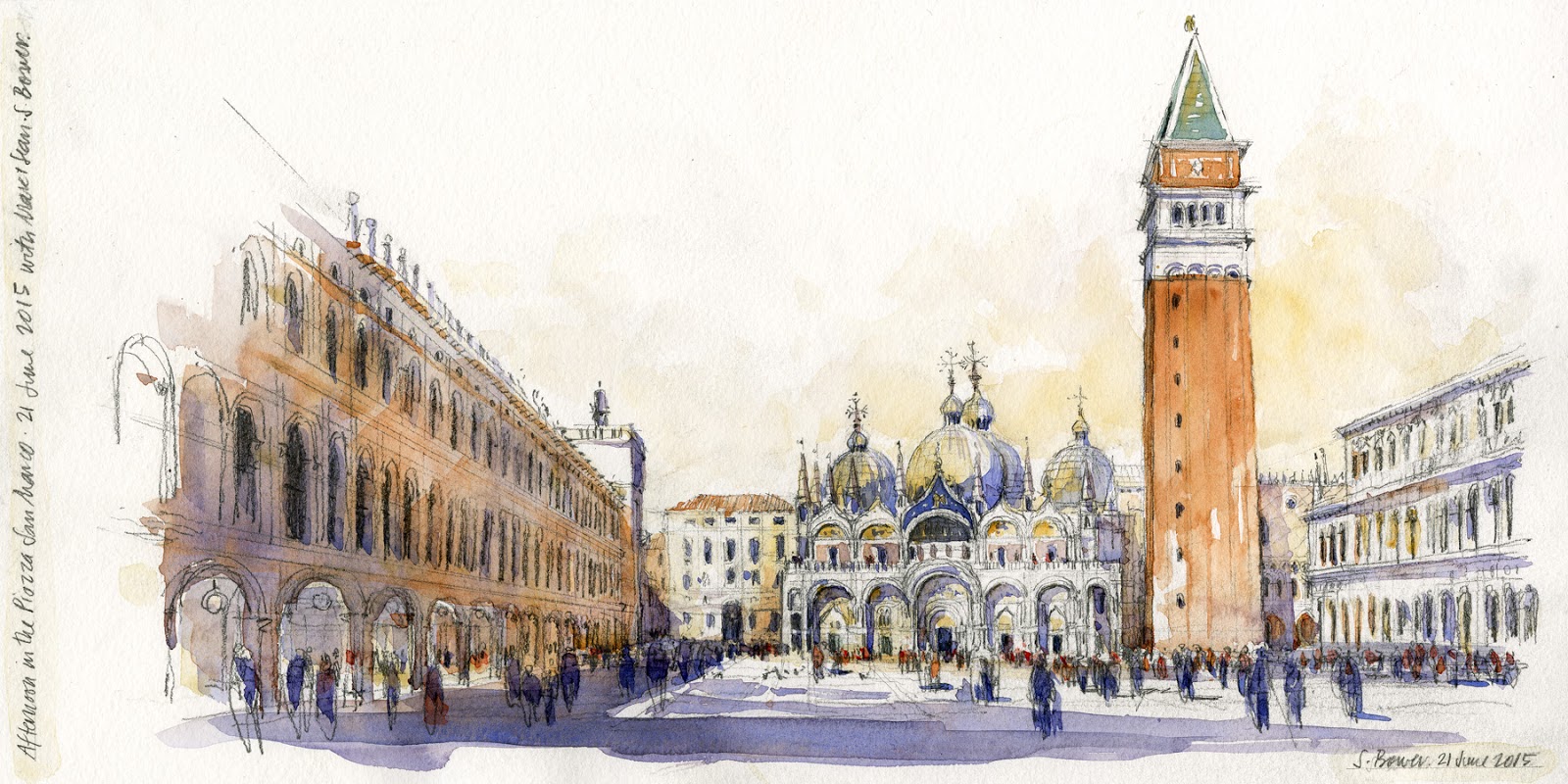
Good sketches start with Good Bones! In this workshop, you’ll learn the simple steps to set up the foundations of a great architectural sketch in Perspective and Watercolor. How do you start a location sketch? Where is the darn Vanishing Point? Watercolor is too overwhelming!


Held in the amazing historic PEARL DISTRICT along the Riverwalk, this workshop offers 2 full days of instruction. The first day is devoted to learning the fundamentals of on-location perspective through demos and sketching on-site. Day two introduces basic watercolor mixing and techniques. Day 3 is a half day that puts it all together in an open sketch meet up!

GOOD BONES Day 1 | PERSPECTIVE | Friday, April 5 | 9am - 4pm* | Meet in front of Cure
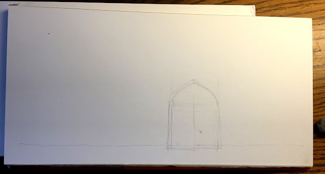
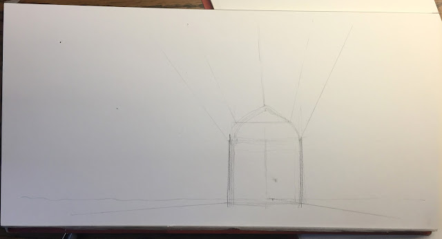
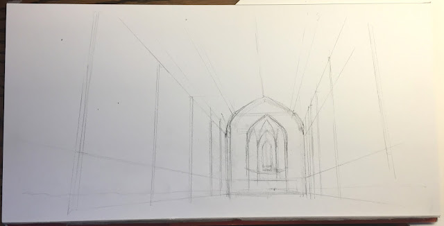
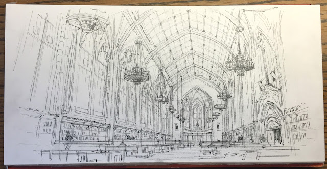
·       Learn perspective basics and a simple step-by-step process to construct an architectural perspective sketch, how to build the sketch in layers.
·       Learn what to look for when sketching perspective on location—how to find your eye level and vanishing points to provide the good bones of any sketch.
·       Learn how to measure proportions and relationships of spatial elements.

GOOD BONES Day 2 | WATERCOLOR | Saturday, April 6 | 9am - 4pm*
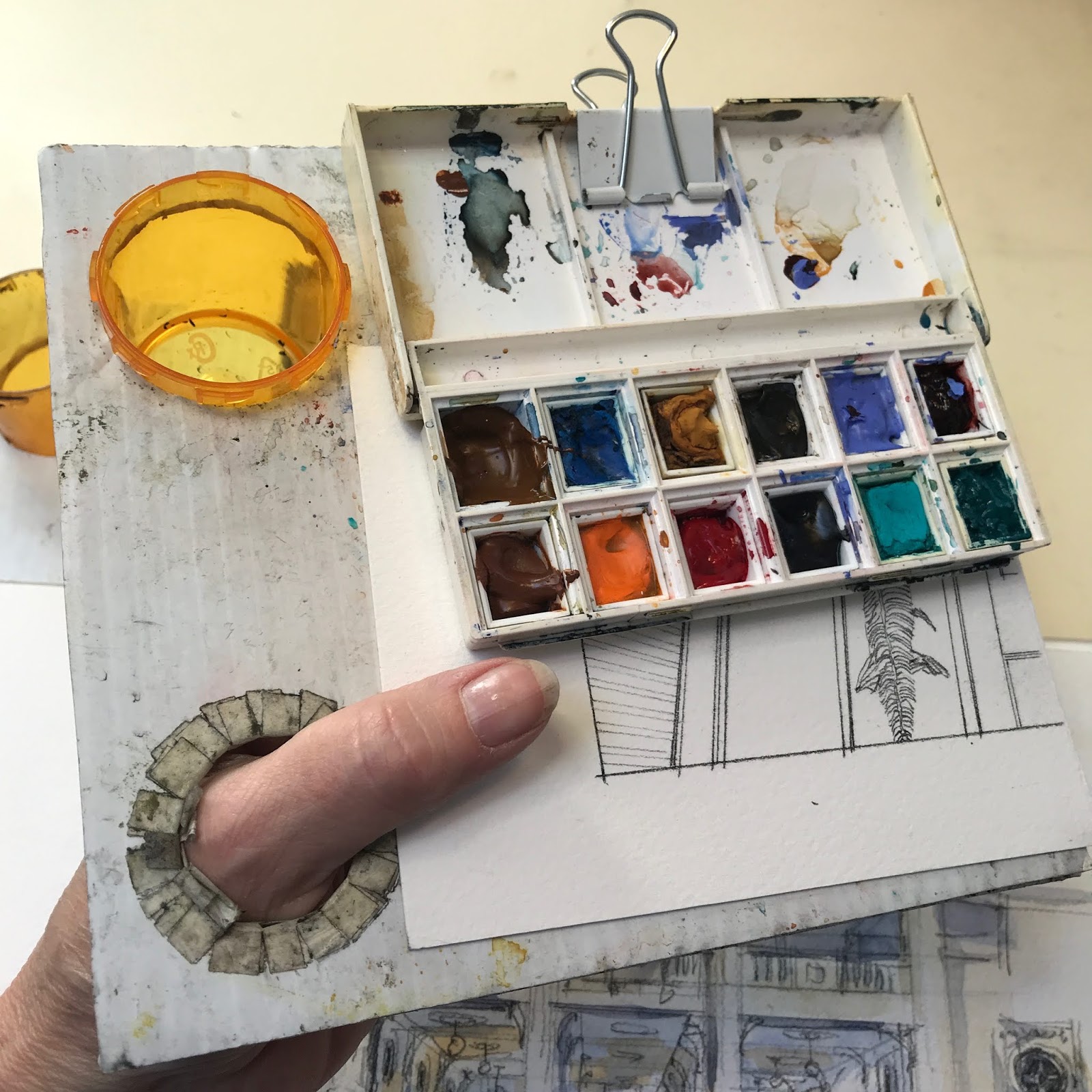
·       Introduction to basic watercolor tools and techniques, using a simple palette of colors.
·       Learn how to use watercolor to enhance the sense of architecture and space in your sketches.
·       In the afternoon, put perspective and watercolor together.                                            * One hour break for lunch.

GOOD BONES Day 3 | OPEN SKETCHCRAWL | Sunday, April 7 | 10am – 12:30pm  Anyone can join us!
·       An important half day to cement what you’ve learned, joined by other sketchers.

----------------------------------------------------------------------------------------------------------------------------------------------------
GOOD BONES SAN ANTONIO is open to 15 participants with any level of experience, but it’s targeted to sketchers who want to improve their basic sketching and understanding of perspective and watercolor.

Workshop Registration opens SUNDAY, February 3, 2019 at 12noon central time. 
To sign up, contact Stephanie by email at stbower@comcast.net  The first 15 emails will be accepted—first come, first served. A waiting list will be created in case spots open up.
Workshop fee is $230.00 payable by check once you are notified via email of a confirmed spot in the workshop.

Cancellation
In the unforeseen event the workshop is cancelled, all fees will be reimbursed.
If you have to cancel your participation, please contact Stephanie Bower at stbower@comcast.net
     By March 1, all fees reimbursed; By March 14, 50% of fee reimbursed; After March 14, 10% of workshop fee reimbursed.
                                    
A materials supply list and additional information will be emailed to registered participants.

----------------------------------------------------------------------------------------------------------------------------------------------------
Workshop Instructor, STEPHANIE BOWER is an award-winning Seattle USA- based architectural illustrator, teacher, author, watercolor painter, and traveling Urban Sketchers correspondent.

Stephanie’s sketching workshops bring together her professional career as an architect and architectural illustrator, her many years of teaching in colleges and universities in NYC and Seattle, and her love of traveling and sketching on location. She was the recipient of the 2013 Gabriel Prize fellowship in Paris and was twice awarded the AIA Dallas KRob delineation competition for Best Travel Sketch.

She is a blog correspondent for the Urban Sketchers www.urbansketchers.org and has taught at the international symposiums in Brazil, Singapore, Manchester UK, Chicago, Taiwan, and Amsterdam 2019, as well as workshops/demos in Australia, Oxford UK, Mumbai, Spain, and an annual workshop in Italy. You can also find her two online classes at www.Bluprint.com.

In addition, Stephanie is the author of the fourth book in the popular Urban Sketching Handbook series, Understanding Perspective and is working on another book due to be published in late 2019. 
For more on Stephanie’s work and workshops, go to www.stephaniebower.com.

++++++++++++++++++++++++++++++++++++++++++++++++++++++++++++++++++++++++++++

This workshop is in a FABULOUS location! The Pearl District in San Antonio is one of the best urban spaces in the country. Beautiful renovated old buildings, farmer's market, cafes and shops, interesting architecture, all along the glorious San Antonio Riverwalk. I hope you can join me!!


Friday, January 18, 2019

Suzzallo Library, a Step-by-Step


I'm thinking ahead to this summer's Urban Sketching Symposium in Amsterdam! Registration starts bright and early February 2, info is here. There are so many amazing workshops planned, I am truly honored to be a part of the incredible line up of instructors. I'll be teaching a workshop called "Towers are Like Wedding Cakes, and other "Ah-Ha" Moments", featuring some tips and tricks that have inspired a new book I'm working on!

I love to teach perspective because it's something so many people fear, ignore, or fake, but there is no need if you understand a few simple principals.

In honor of this Sunday's Seattle Urban Sketchers meet-up at the University of Washington's Suzzallo Library, I'm posting this step-by-step from a few years ago in order to show 
my very "architectural" process for constructing and completing a perspective sketch.


Step ONE, Looking at the view ahead of me, I simplify what I see to a very basic shape, starting with a rectangle. This is basically what I call the "shape of the space", as if you were to slice the room like a loaf of bread, this is the shape you would see. It's the shape of the end wall. I measure the height and width with my pencil, then I transfer that shape to my paper. I place this shape very low on my paper, as I want to be able to draw a lot of the ceiling.

Then I locate my eye level and mark it in my sketch by drawing a horizontal line all the way across my paper...notice how LOW my eye level is relative to the shape of the space drawn. almost on the floor. On the eye level line is the vanishing point, that tiny dot just to the right of center (not the smudge right above it!) That spot is directly in front of me as I face the back wall of the space, and it's the point where the many receding lines will all converge, making this a one-point perspective sketch.


Step TWO--by drawing in the three elements of step one (big shape, vanishing point, eye level), I have everything I need to do this drawing accurately in perspective. I can use the vanishing point to start drawing in the big lines, the major architectural elements of the space.  For this, I use a small plastic triangle, as it speeds things up to be able to snap accurate lines QUICKLY...


Step THREE-- you can see I'm putting more of the bones in...the verticals represent the columns, or each structural bay of the space.  I start to angle the lines closest to me to exaggerate the sense of height.


Step FOUR-- I start working on putting in the ceiling...big shapes get broken down into smaller shapes, then I break those shapes into even smaller shapes...that is how structure works!  I also start to put in the chandeliers, as they cover up a good bit of the ceiling. Each one relates to a structural bay in the ceiling, and the lamps on the left relate to the lamps on the right.


Step FIVE-- here is pretty much the complete line drawing.  I try to build up the focus with detail and linework at the back, allowing the lines closest to me to fade out.  I also added the book shelves, as that builds up the sense of activity at the pedestrian level and helps to ground the sketch.  Notice how FLAT the tables are because they are so close to my eye level. Notice how details are just suggested, I don't take the time to actually draw in every detail.


Step SIX--Color...I started by putting an underpainting layer of yellow on all the areas I want to be warm, usually the surfaces that advance spatially or are in the sunlight (what little there was!)  Then I layer in more colors...mostly grays, as nearly everything in this space was gray to beige...I also build up the color carefully at the end of the space, the focal point of the perspective and the sketch.


And here is a scan of the final image, complete with signature and reminder of where I was! Also a detail so you can actually see the linework.  I often lose a lot of the linework once I add color, which always makes me a little sad, as I LOVE the pencil work. 


So there it is, beginning to end.  Good practice for Amsterdam this summer!! It took about 1 hour and 15 minutes, sketched and painted on location. Paper is a Fluid watercolor block 8" x 16", Winsor & Newton watercolors, and my favorite Escoda Reserva size 10 travel brush. Also my 1" angled synthetic brush. for broad strokes in big areas.


I hope you found this helpful...see you in Amsterdam at the Symposium !


Sunday, November 18, 2018

Presenting Perspective at Daniel Smith, Seattle on December 2, 2018


MARK YOUR CALENDARS for this free demo!

SIMPLE TIPS THAT EVERY ARTIST NEEDS TO KNOW ABOUT PERSPECTIVE
Sunday, December 2, 2018
11:00 am - 12:30 pm
at Daniel Smith Artist Supplies, Seattle store

I'll be giving an interactive lecture on my favorite sketching tips and tricks for understanding perspective. Bring a pencil and sketchbook, as you'll be drawing too!!!

Hope to see you there!

Monday, September 17, 2018

Necessity is the Mother of Invention...


Sketching at the Kimbell Art Museum in Fort Worth, TX.

Urban Sketchers are such creative people! We figure out all kinds of workarounds and tools to make location sketching easier and better!
     Those of you who have seen me work in person know that I like to use a tripod/easel and a hand-held palette (for lack of a better word) for painting on location. I've found the easel is essential when I teach, so that people can better see what I'm doing (thanks to the workshop participant years ago who suggested this!) This invention came about after seeing variations on what other sketchers had, so I came up with my own version that uses a medicine bottle...it works great! It's approximately 7.5" x 6.5" and cut from corrugated plastic.

In India, however, I was not permitted to take the easel into a lot of the famous architectural sites. As luck would have it, right before I left, I happened to make a larger surface to use. I can still attach my paints, paper and water, but it sits in my lap! I found it worked pretty well, so now I carry it with me when I go out to sketch--its lighter than the easel, which is great. The size is 12" x 15"--the largest I could make that fit in my backpack.The only trick is remembering to slant it a bit when painting!

Here are the two versions I now use...the older tried and true hand-held palette, and the newer lap version...what do you think?

In Varanasi, India last November 2017,


At the AMAZING Ellora Caves in Aurangabad, India.

In Rome, June 2017, with the talented Kelly Medford.


In Italy last May 2017, during the Draw Civita workshop.
Thank you, Vanni, for this great photo!!

And sometimes, I just sit on the ground and use my tiny stool as an easel...

On the grass at an important Buddhist site in Sarnath, India, 2017.

All these methods work great, depending on the situation. Have you tried any of these palettes?

Tuesday, July 17, 2018

TIP 10/10: Domes are ROUND!


And here is the final post in this series of 10 TIPS!

Sketching Tip #10: Domes are ROUND!

This may seem rather obvious, but I see so many sketchers draw domes as sort of flattened out the shapes in which the "edges" are drawn as if they were sharp corners instead of rounded.

Domes are essentially a stack of ellipses, each ellipse sharing a common centerline. Take a look at this diagram of the round Radcliffe Camera done in my workshop in Oxford, England last year:


You'll notice that this building, similar to a dome, is a stack of ellipses in perspective.
All the ellipses are centered on one line in the middle that also connects the
very top of the dome with the center of the footprint of the building on the ground.  

You'll also notice that each ellipse gets FLATTER the closer it is to your eye level line.

Understanding this concept points out why the diagram of the flattened dome with "corners" is incorrect, and the rounded dome edge below works much better!


Domes don't have sharp corners!!


The "edges" of your dome should look more like this. They are rounded and
you can see the shape of the ellipse starting to curve behind the building.

And here is the completed sketch! You can see and feel the roundedness of the forms, especially by looking at the rounded "edges".


These same concepts apply to any rounded form. Take a look at this sketch of a building near Piccadilly Circus in London...


I hope you have enjoyed and learned a bit from these 10 blog posts! I will continue to post tips and more sketches, so please sign up to receive these posts by email using the sign up on the bar on the right.

And if you want to learn in person, I'll be teaching workshops next year in Spain and Italy...and more places too! 
I also have two online classes at Craftsy.com and a book you can find anywhere, 
The Urban Sketching Handbook: Understanding Perspective.

Thank you so much for your interest, and Happy Sketching!
Remember, don't fear perspective!!
Stephanie


Friday, July 13, 2018

TIP 8/10: Towers are like Wedding Cakes


Only three more to go! Here is sketching tip #8 of 10...

Sketching Tip #8: Towers are like Wedding Cakes!


Imagine a wedding cake...if one layer is off-center from the one below it, eventually we'd get a tragic cake collapse and wedding disaster!


Same for Towers. I often see towers in sketches that somehow look a little off. The reason: it's layers are not stacked properly in perspective!

So how to better sketch a tower? I'll show you two ways.

Method 1 -- find the center of the tower.
     As in wedding cakes, it's important to establish where the center of the tower is in order to draw it properly. We do this in perspective by using your skills from middle school geometry class:  drawing diagonals.
     If you think of the forms as transparent, this is much easier. I look at a tower and I think of a stack of 3-d blocks, usually getting smaller/narrower toward the top. I often lightly draw in the entire center line up the arch for reference. You can be sure whatever detail is at the very top of the tower, it sits on top of your center line!


Venice in 2015, sketching what may be one of the most famous towers in the world, the Campanile in the Piazza San Marco.
Here I am on the left, sitting in spot of great honor with the incredible Marc Taro Holmes and his friend and mind-boggling illustrator, Sean Andrew Murray. HA! No pressure at all !?!?

You can see how I don't just see the face of the sides of the tower, I see it as a stack of 3-dimensional blocks. 
Remember one or both sides of your tower will go to the vanishing point/s on your eye level.
Consider, each face of the tower steps inward toward the center from one layer to the next.


And here are the steps I use to draw the tower:

1 -- Start with the blocks, as above.
2 -- Use diagonals to find the center of each block.
3 -- draw in your center line all the way to the top of the tower.
4 -- Here, once I find the top of the center line, I can just connect it to the corners to get the pyramid shape at the top. This is easier because the faces of the pyramid are sloped.

I don't always draw every level like this, but it's important to understand this concept when you sketch a tower.


Method 2 -- Use Edges
     In reality, I probably use a combination of methods 1 and 2. This way is definitely easier... I look at the edges and where they are relative to each other. Examine how much each is set in from the level below it. 
     And at the end, I look at where the top of the tower is relative to the layers below, just to check I've got it right.


In this sketch of a tower at the Mezquita in Córdoba, Spain, you can see 
how each corner is set in from the one below it. An easy way to draw 
towers, although be careful you don't pull the layers off center!

Hopefully, one or both of these methods will help you see towers a little differently, and draw them better!

Saturday, July 7, 2018

TIP 6/10: Sloped Roofs in Perspective


Sketching Tip #6:  Sloped Roofs in Perspective

Sketching a sloped roof, or any sloped surface, can be a real challenge. I pretty much always draw lines down the slope of the roof so that the angle of the roof reads, no matter what the roof material is. The clearest way to understand this is to look at tile roofs with ridges and valleys, like this one at Brunelleschi's  Pazzi Chapel in Florence in this classic, one-point perspective view.

Step one is to find the vanishing point and your eye level for most of the parallel horizontal building and ground lines. My eye level line was very low, close to the ground, and the VP just to the right of center.


To draw the slope of the roof correctly, the first line I draw on the sloped roof is a true vertical line (in yellow) directly above my vanishing point at eye level... yep, straight up and down right over my vanishing point! 
Then, I know that all the ridges and valleys to the left of this line angle in one direction, and all the lines to the right of this vertical line angle in the other direction. The farther the line is away from my vertical, the flatter the angle.  I usually eye-ball this. 
Take a look...


So what is really going on here? Remember that lines that are parallel to each other converge to the same vanishing point, so since the roof is angled, it goes to its own vanishing point in the sky...

Remember this tip: 
if a surface tilts UP and away from you, the Vanishing Point also tilts UP.
The part that most people don't realize is that the vanishing point for the slope is directly over your eye level vanishing point!!


This principle is also true for 2-point perspectives, but it's easiest to see in a 1-point view.

Look at this view from Florence and see if you can find the vanishing point and how I drew the tile roofs!


Friday, July 6, 2018

TIP 5/10: When Buildings Twist, Multiple Vanishing Points!


Welcome to a series of 10 Sketching Tips!

#5: When Buildings Twist

Key to this concept is to remember a basic principle of perspective, that lines that are parallel to each other appear to converge to the same point.

Quick trip back to Venice. I'm standing on the upper level of the Basilica San Marco. Using my pencil, I extend the receding lines on the left side to find one vanishing point on my eye level line.


Then I use my pencil to extend the lines of the building on the right, and what happens? I get TWO vanishing points, both on my eye level line!  
So, what does this mean? It means the two buildings are actually not parallel to each other in plan (like a map view)... each facade has generated it's own vanishing point. 
Key also is that BOTH vanishing points are on my eye level line--yet another good reason to mark where your eye level line (aka Horizon Line) is located in your sketch!

Does using the two VP's for this sketch make a huge difference? Probably not, as they are so close to each other. The only way I could have realized this was by drawing it!! BUT this concept in perspective is extremely helpful to understand when you are sketching anywhere that was not built on a grid plan, like most of Europe, India, and many other places in the world.


Let's look quickly at another example in Italy. This is Civita di Bagnoregio, an amazing tiny hilltown north of Rome where I teach a sketching workshop every summer. This view is of the narrow main street behind the church. The buildings twist and turn in plan along a curving pedestrian street.

This is a diagram I made in the workshop to explain the concept of multiple vanishing points. I used my pencil to extend the vanishing lines (usually using the tops or bottoms of windows or stone courses), and lo and behold, I get three separate VP's, each on my eye level line, one for each building.


Here is a break down of the three VP's...

In summary, it's easiest to remember that when:
--the building rotates in plan toward the left, the VP shifts to the left along your eye level line
--the building rotates in plan toward the right, the VP also shifts to the right along your eye level line.

I hope this explanation helps! Happy Sketching!
To receive these and future posts, please sign up!